xFi Gateway Activation
Project Summary
Design a tool that empowers high-speed data customers to set up their own internet hardware and services.
My Role
Lead Product Designer: UI/UX/Interaction Design, Information Architecture, Process Strategy, Copywriting, Art Direction
Background
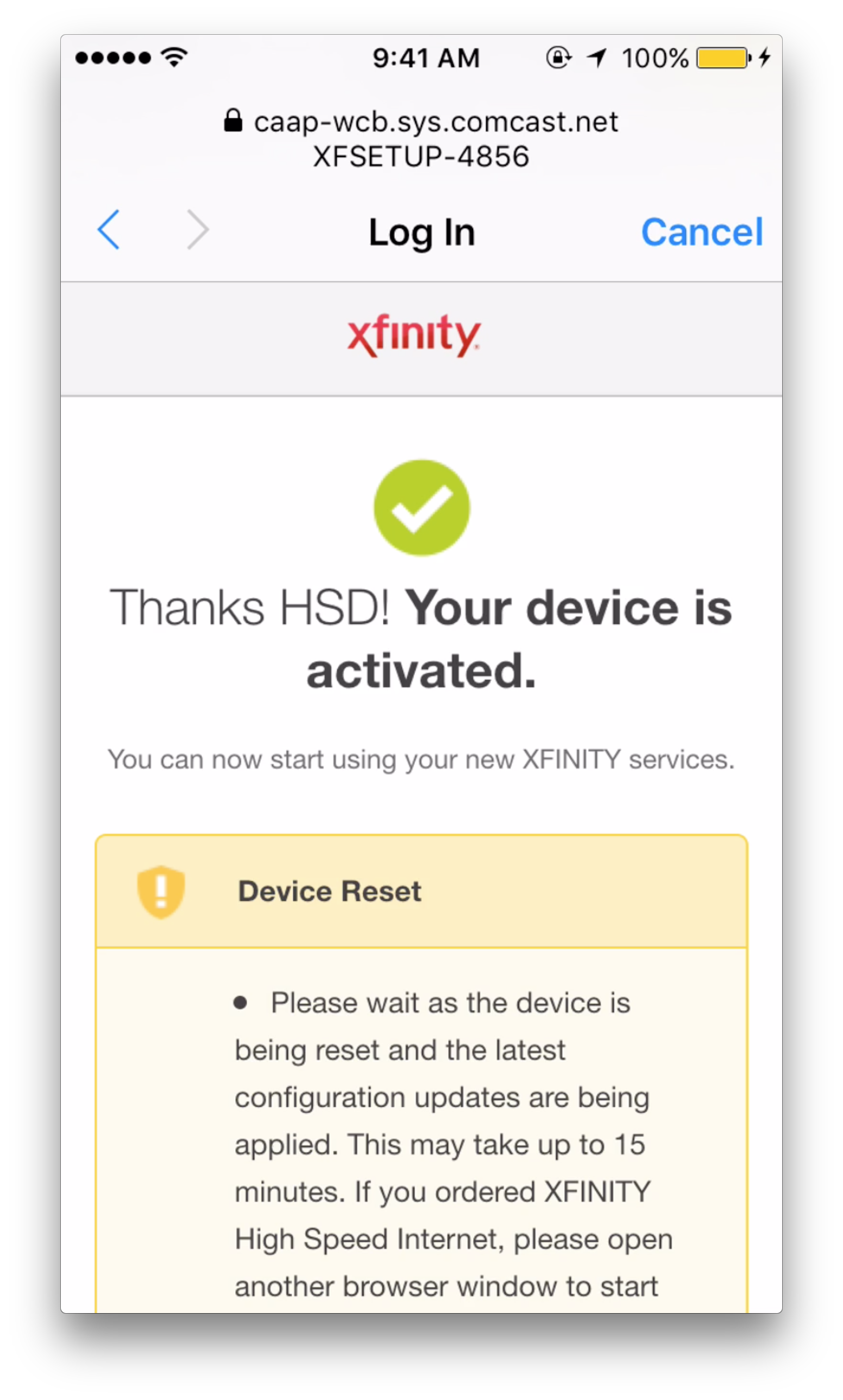
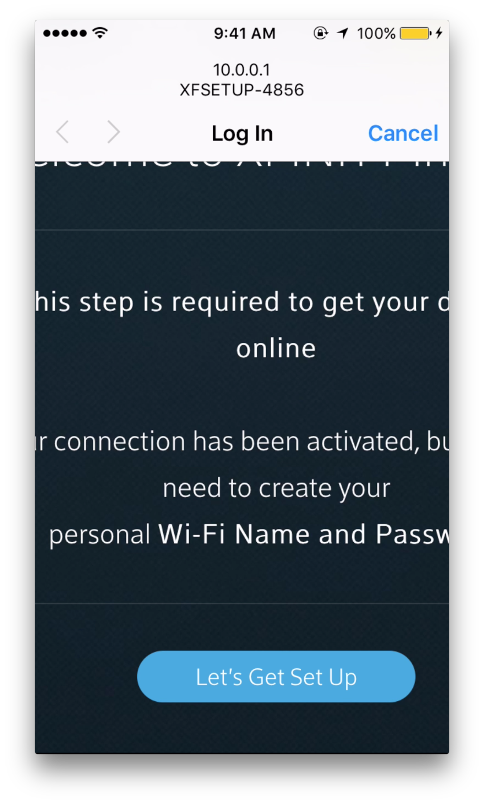
Xfinity xFi is the companion app to Xfinity high-speed data hardware and subscription services. xFi is available to 10 million HSD consumers. In the past year it has been downloaded 2.6 million times and 224k users have successfully activated their Xfinity services through the app.
In building xFi, our team's focus was to provide users with tools to manage, customize and control their home WiFi network; reduce customer service call volume by educating consumers about the complexities of modern internet services; and push the envelope of Comcast's product and user experience design.
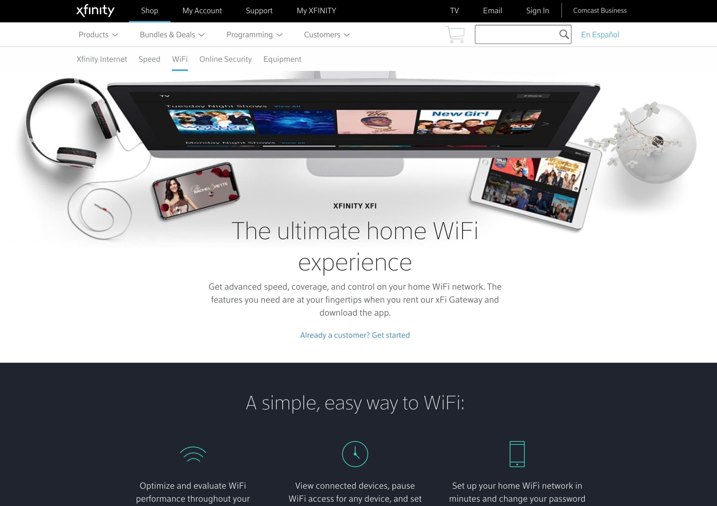
Xfinity xFi product as presented in web shopping experience
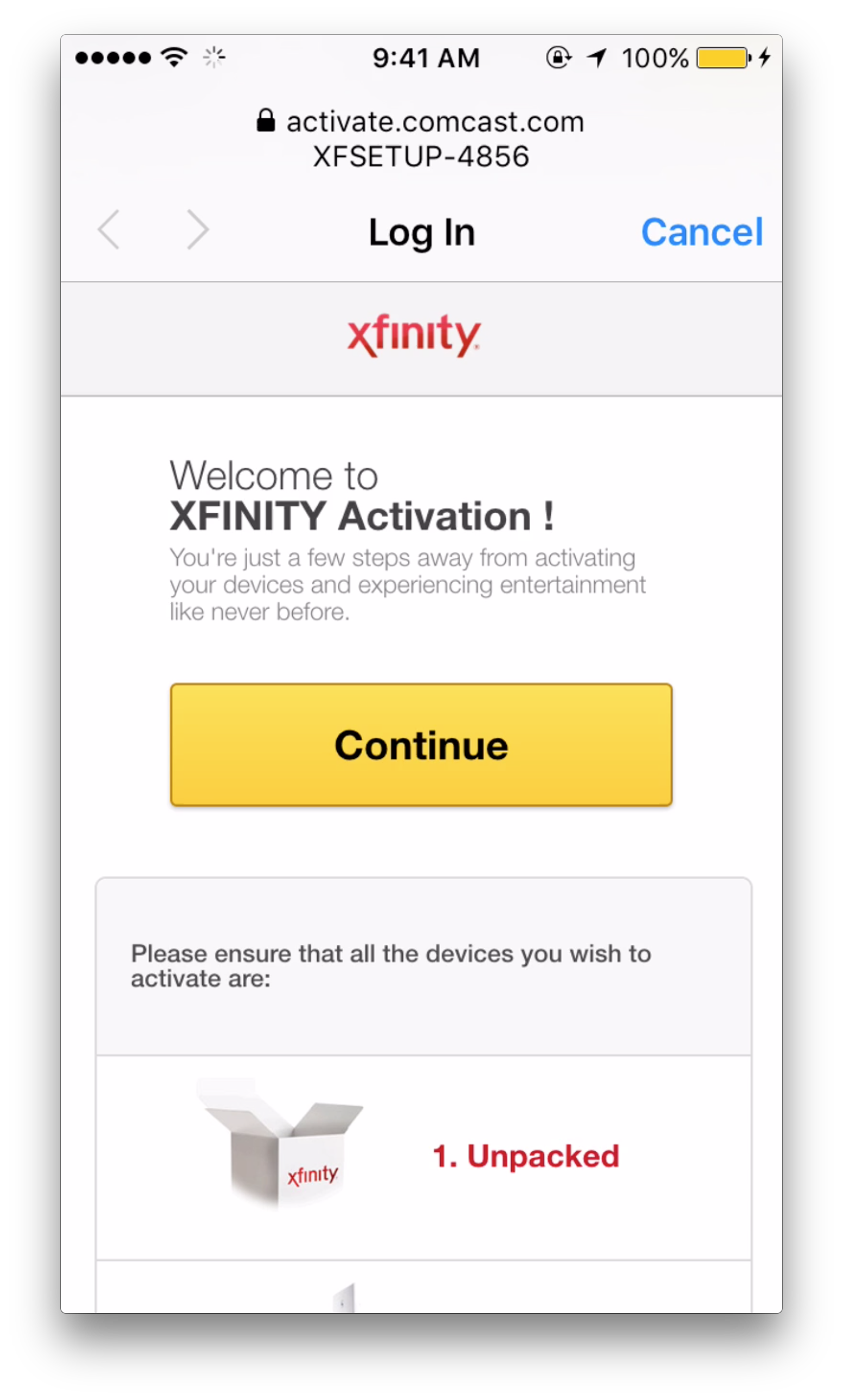
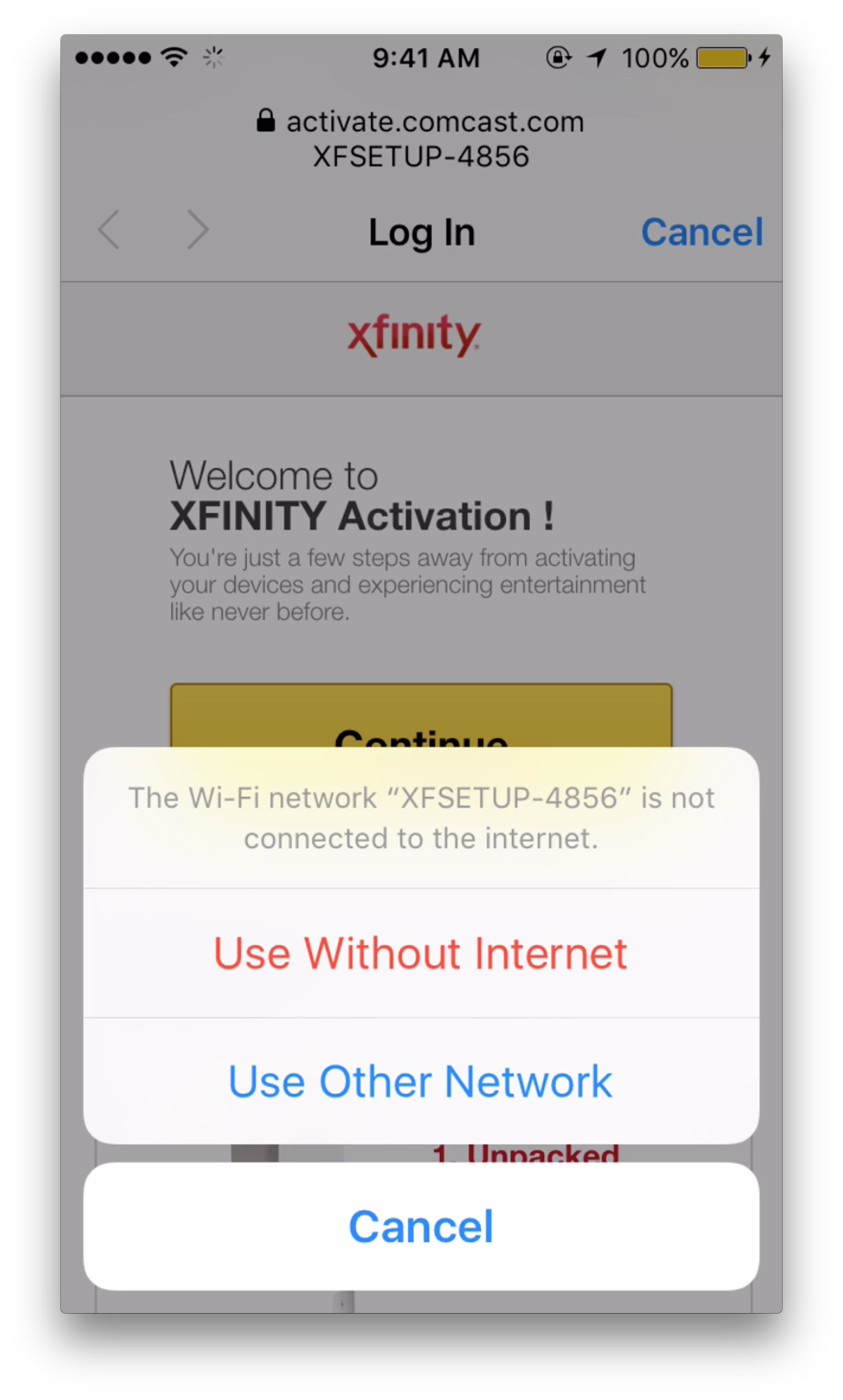
Original mobile experience for activating Xfinity equipment
Until xFi was launched, and a focus of the app became activating HSD services, customers were presented with some less-than-ideal methods to get their home internet up and running. Legacy systems from another era — developed before the establishment of a dedicated UX team — provided unfriendly flows (often designed first for desktop experiences), that resulted in a fragmented, burdensome experience for users.
Call-in rates were extremely high. Users experienced issues all along their activation journey: plugging in their hardware, turning on their hardware, personalizing their WiFi network, activating their services, and finally even joining their network once it was set up.
A company-wide mandate to provide exceptional, digital-first customer experiences meant that this particular touchpoint was in need of serious improvement.
Discovery
My task
I was responsible for designing the various activation features inside of xFi. My goal was to ensure a frictionless and successful activation of the user's hardware and internet services, while balancing their needs with business requirements (those of product, sales, marketing teams), all while minding technical limitations. As part of a new team, I kept my eye on producing a sustainable, expandable design process.
Sketches
Based on audits of existing functionality, and meetings to discuss added or removed functionality, I started with sketches of user flows to approximate expected user paths through the activation experience.
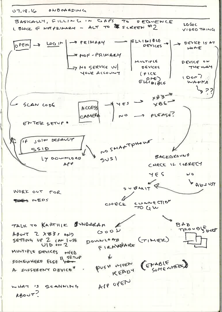
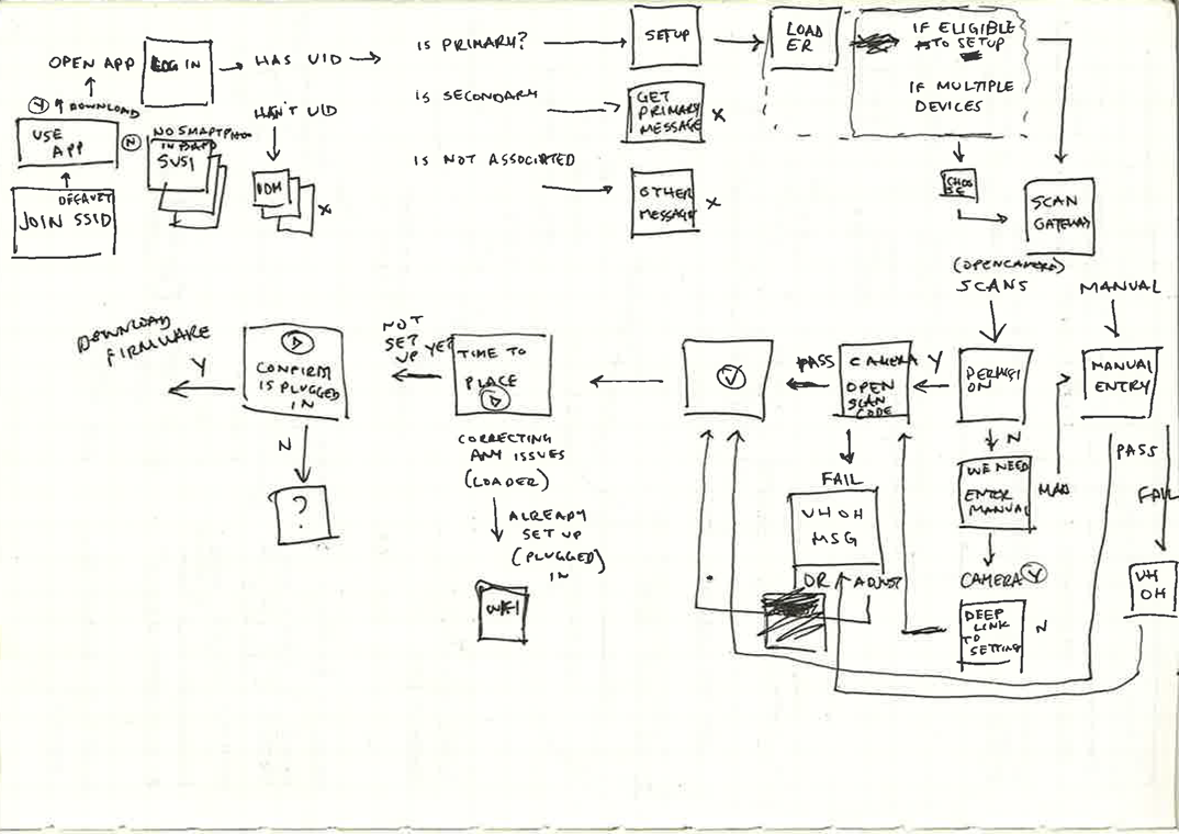
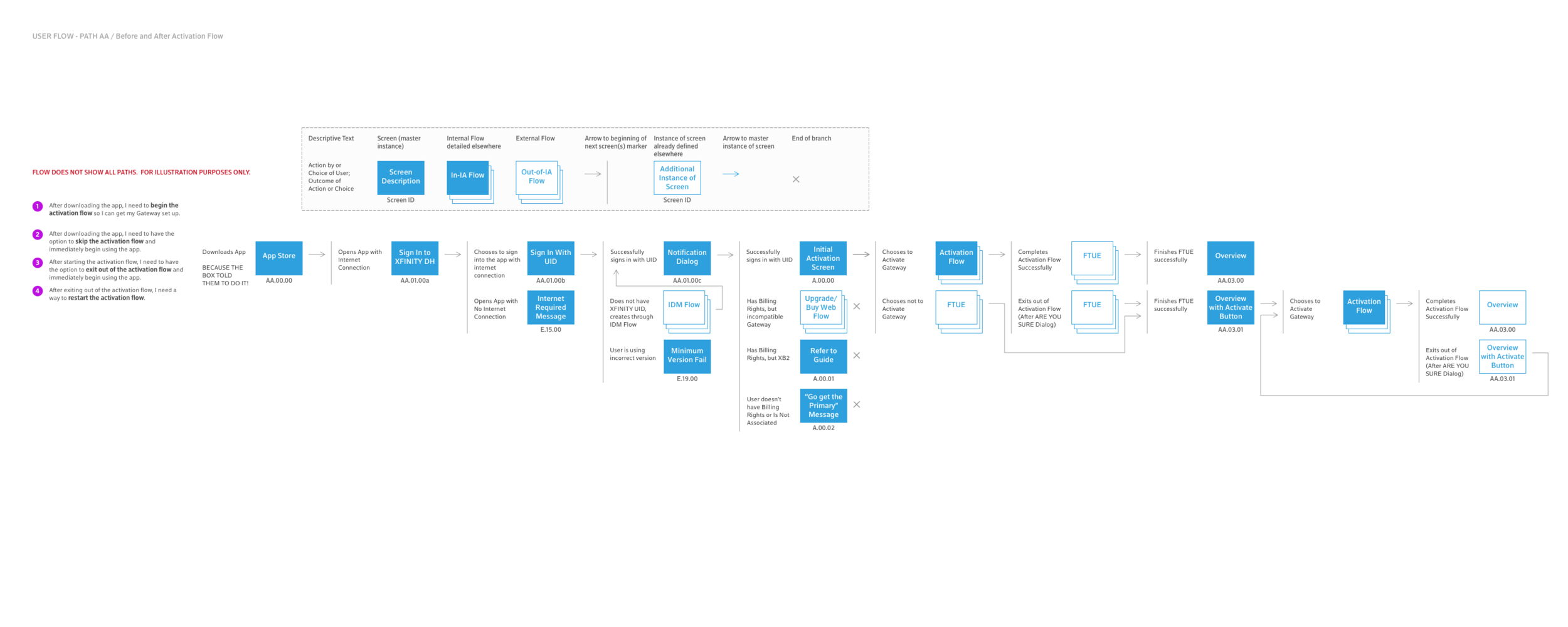
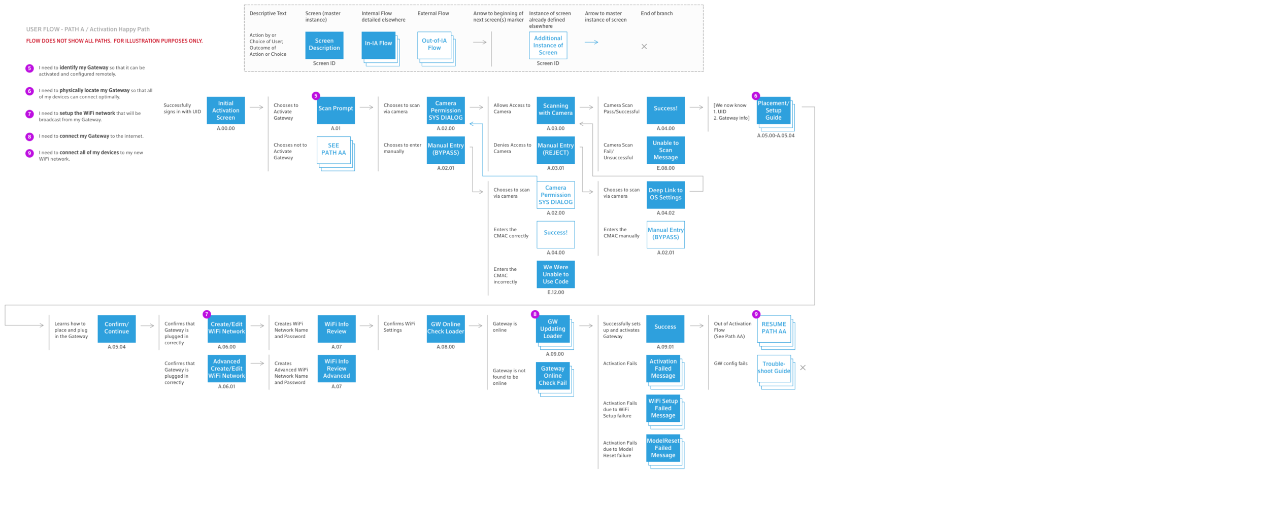
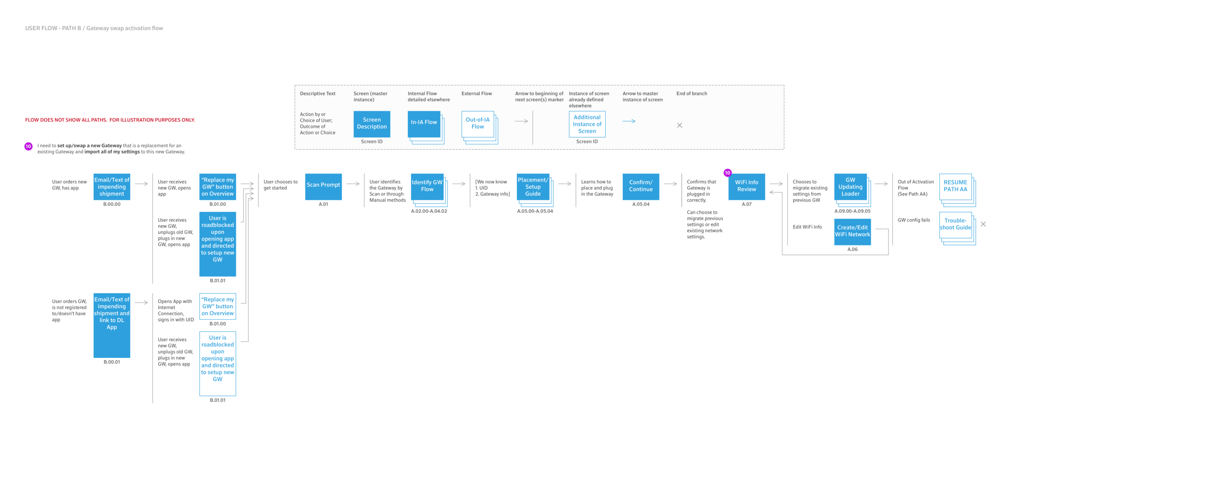
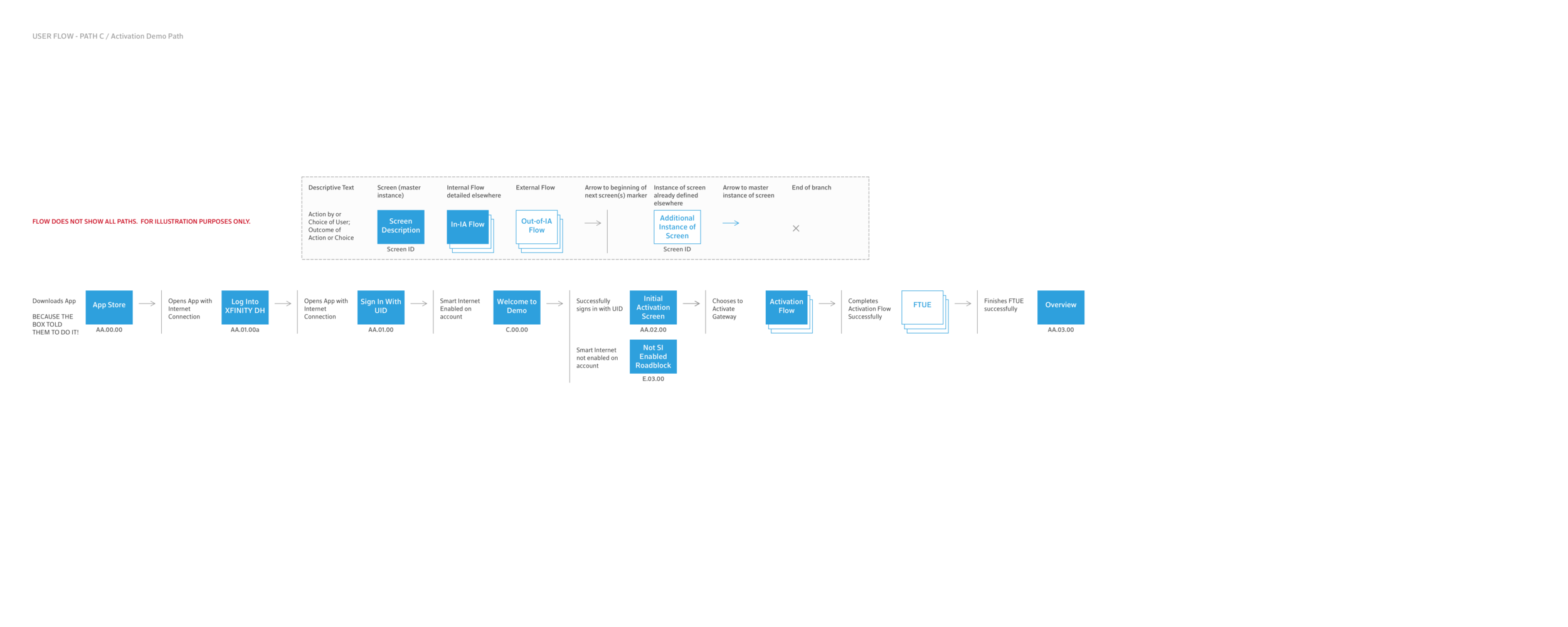
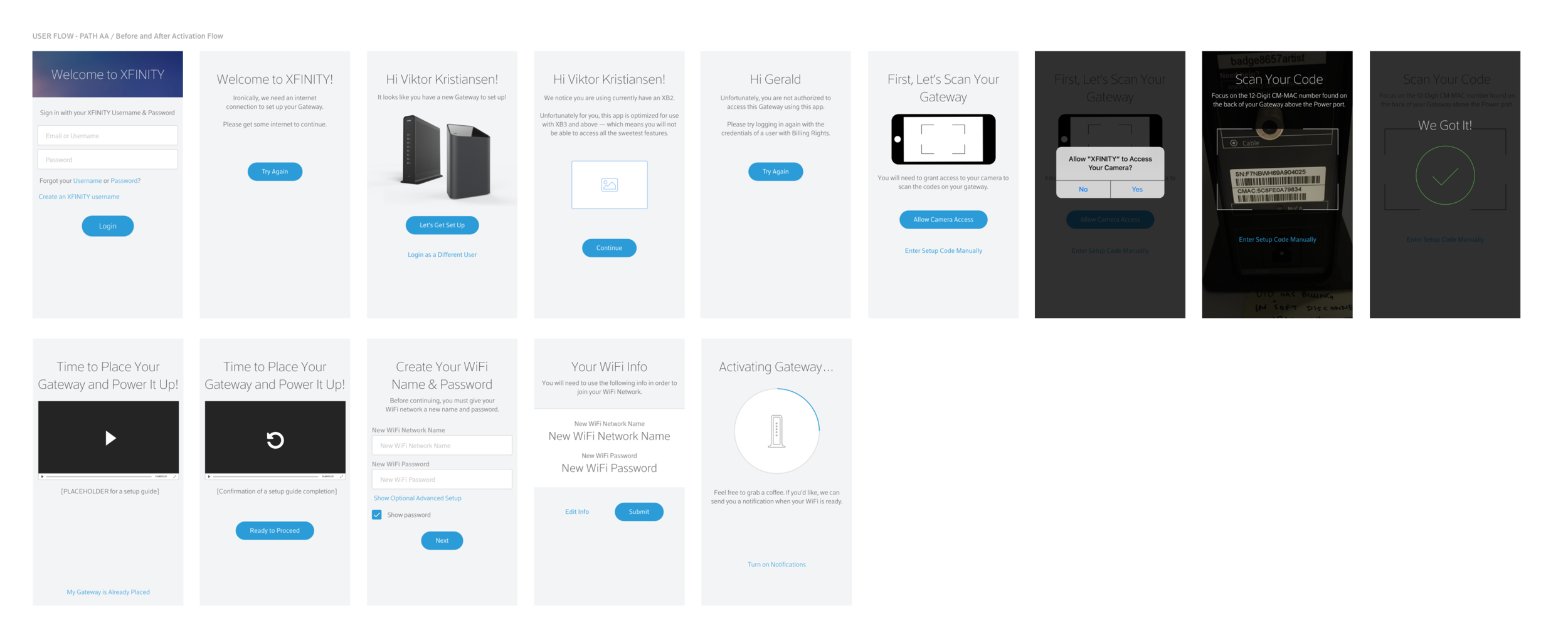
User flows
These sketches and notes became users flows, which were used to frame technical discussions with development and product teams, ensuring alignment on basic the basic user journeys before committing to visual design directions. In addition to the ideal journey, we identified and explored potential pain points and error scenarios.
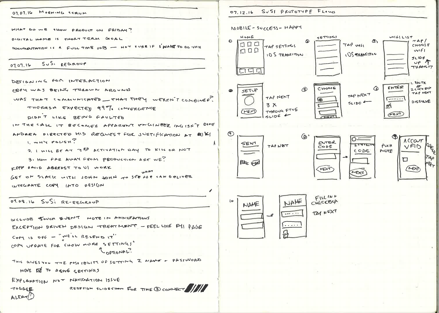
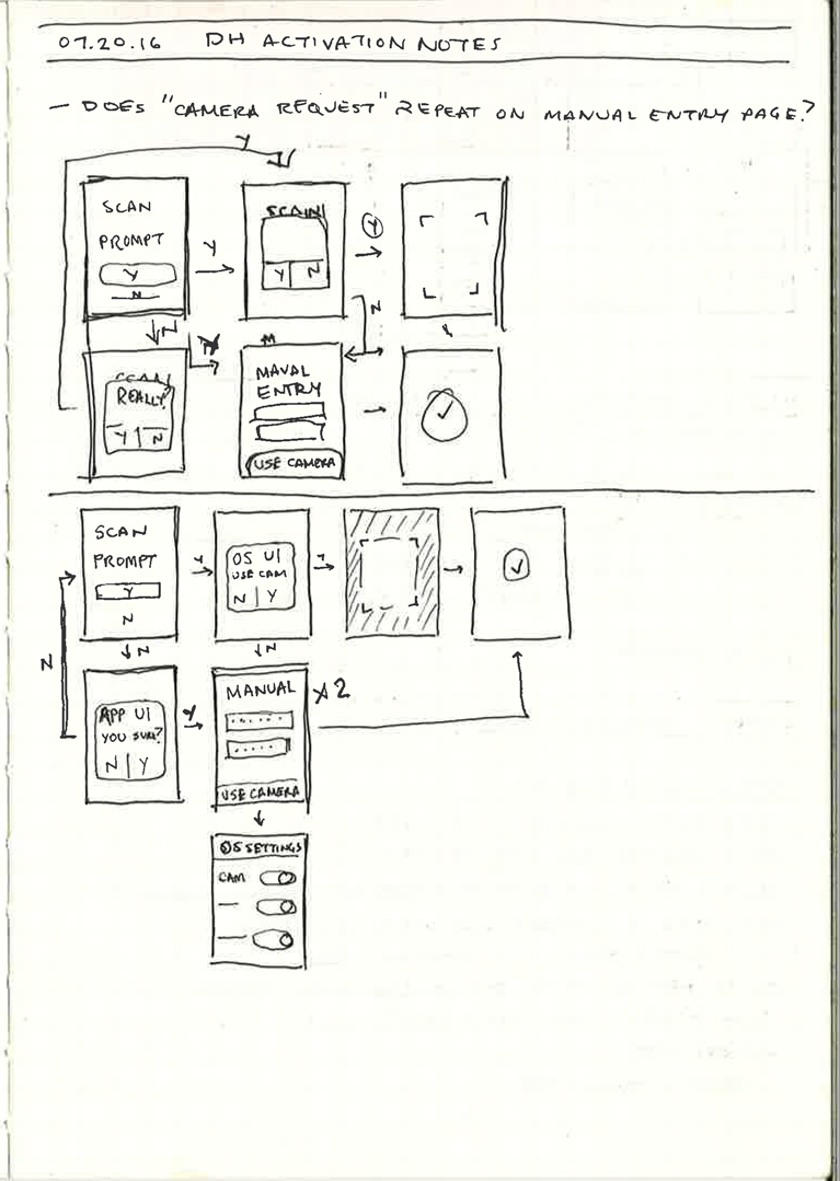
Wireframes
This method allowed for the visual design to move quickly. Once the basic user journeys included necessary functionality, thoughtful considerations of pain points and potential rough patches, we explored various design layouts in low fidelity wireframes mapped to the clearly labeled and indexed screens from the user flows.
Exploration
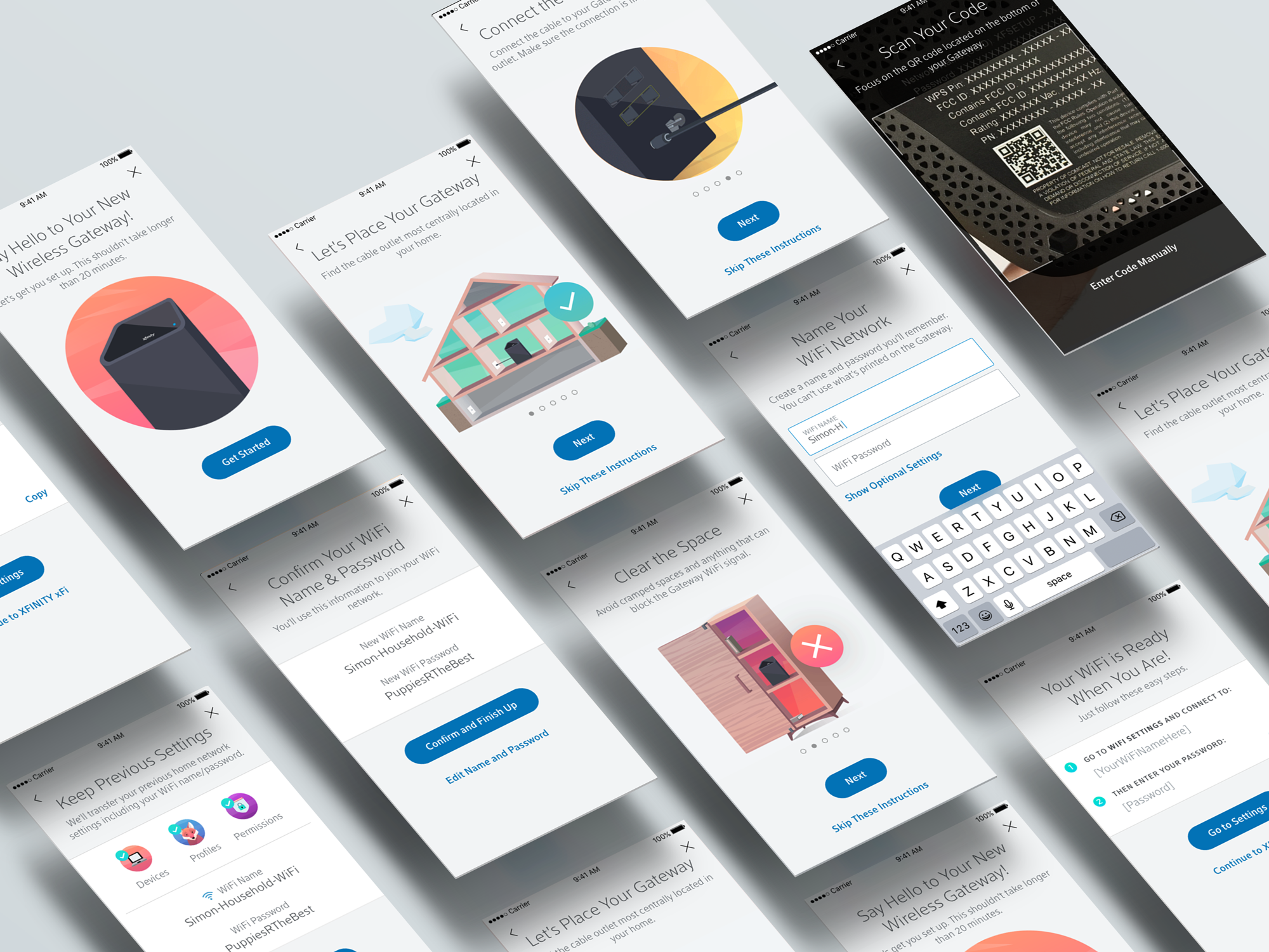
Animations and Illustrations
Concurrent with the development of the user flows, I worked with our design team to produce Illustrations and animations that would help to create an engaging environment as we guided users through their activation experience.
From placement to installation, we needed to communicate about physical tasks users would be going through, provide recommendations for best practices, and give a sense of completion and accomplishment.


Implementation
Screenmaps and Demo Video
The activation flow went through a number of iterations to improve understandability, simplify the design, and identify problem areas. Test days were arranged to put functioning MVPs in front of employees for dog-fooding sessions. Conveniently, many of the employees available for these tests were also customers, and in fields unrelated to our work. Though the test days were mainly organized to test functionality, our team attended to investigate usability and look for insights that would improve and further inform design considerations.
Delivery was made through JIRA and Zeplin, working with the product managers, project managers and developers to create, define and shape epics and user stories. These screen maps were useful tools as deliverables, for design QA tasks, and to communicate the experience across the many teams (from Marketing to Legal to Customer Experience) needed for ultimate app approval and release.
Product Demo
A simple and engaging tool that enables internet customers to set up their own internet hardware and service.
If prompted, the password is jasonjasonjason
Learnings
Designing products at a Fortune 500 company is somewhat different than designing products at a startup. Understatement of the year, that one.
I've learned the importance and necessity of balancing the needs of various stakeholders while advocating for the needs of users. Our stakeholders are our champions to the outside organization. It was essential to listen to concerns and ask lots of questions. This enabled our team to understand the underlying business goals of various requests or suggestions or feedback, and so to begin the process of translating them into simple, meaningful, understandable experiences for our users. And coming back to our stakeholders with solutions that clearly addressed — in demonstrable ways — their particular concerns, built trust and developed our stakeholders into advocates of design oriented solutions.
Taking cues from my experience at a smaller organization — where everyone knew everyone and we all worked in the same room — I learned that to gain necessary knowledge, one must be fearless in acknowledging that you may not have all the answers, and then be equally fearless in finding those answers.
I've learned that, barring actual user data, the reality of designing a product from scratch is that everyone will make assumptions. The key is to acknowledge this, find common ground with as many team members as you can, and make decisions to move forward together. In the meantime, finding an inclusive method to record, analyze, and test those assumptions ensures that designs can evolve, and we're not just stuck with what was once best guesses.
Reinforcing the importance of process, this project also taught me how to identify where process is failing and how to iterate, improve, or sometimes start over on existing workflows, communication methodologies, and delivery methods.

Design Lead Responsibilities
represented user experience team in kickoff, pre-grooming, grooming, and review sessions
developed, documented, and executed a replicable process for the introduction, design, and delivery of key product features
established a communication strategy to organize key contributors in meaningful dialogue
coordinated learning sessions to generate and test assumptions
oversaw outreach and collaboration with UX research teams
worked with a team of designers to develop a visual and illustrative animation style
UI/UX Design Responsibilities
worked with Information Architect to map out optimal paths of user success, user flows, and user journeys
established design patterns and integrated new styles into existing style guide
designed UI elements, animations, interaction patterns, layouts as screens and screen states
documented visual and interactive patterns for grooming and reviews with product and development
catalogued pain points and failure points
delivered comprehensive design comps and redlines for development
created low- and high-fi prototypes in Invision and Flinto
worked with developers every day to test assumptions and get feedback
wrote, reviewed, and edited copy